

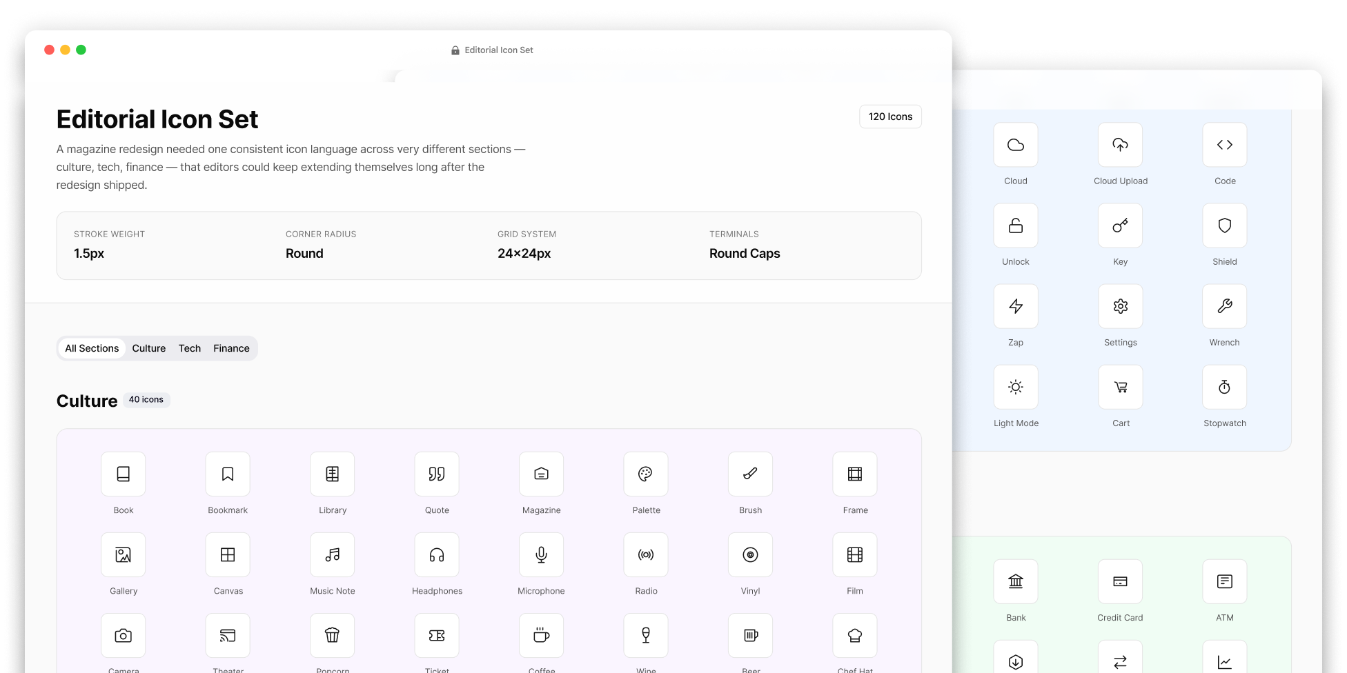
Editorial Icon Set
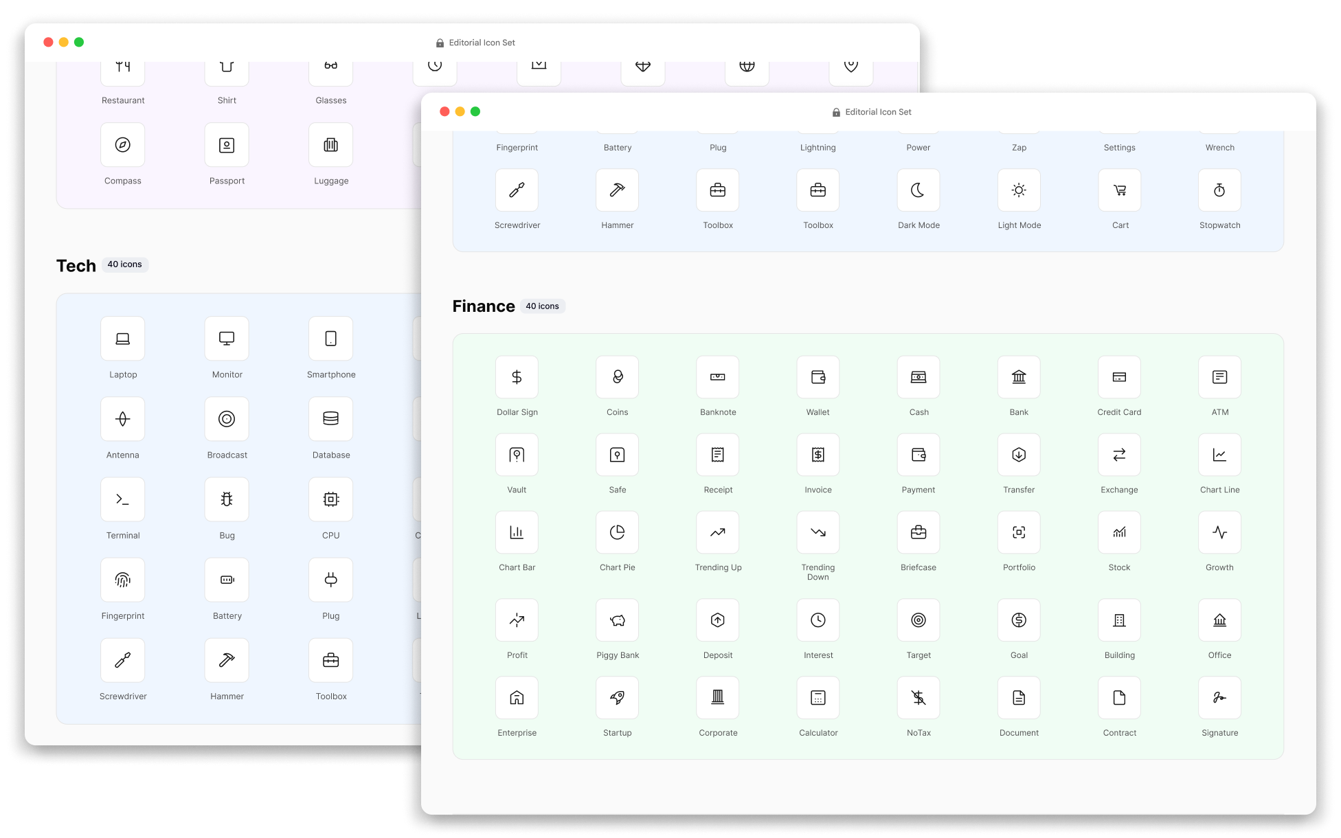
The magazine redesign required a unified iconography system that could work consistently across very different editorial sections — including culture, technology, and finance — and remain easy for the editorial team to extend long after the redesign was launched.
Role
UX/UI Designer
Year
2016
Platform
Icon set
Team
1 designer
The challenge
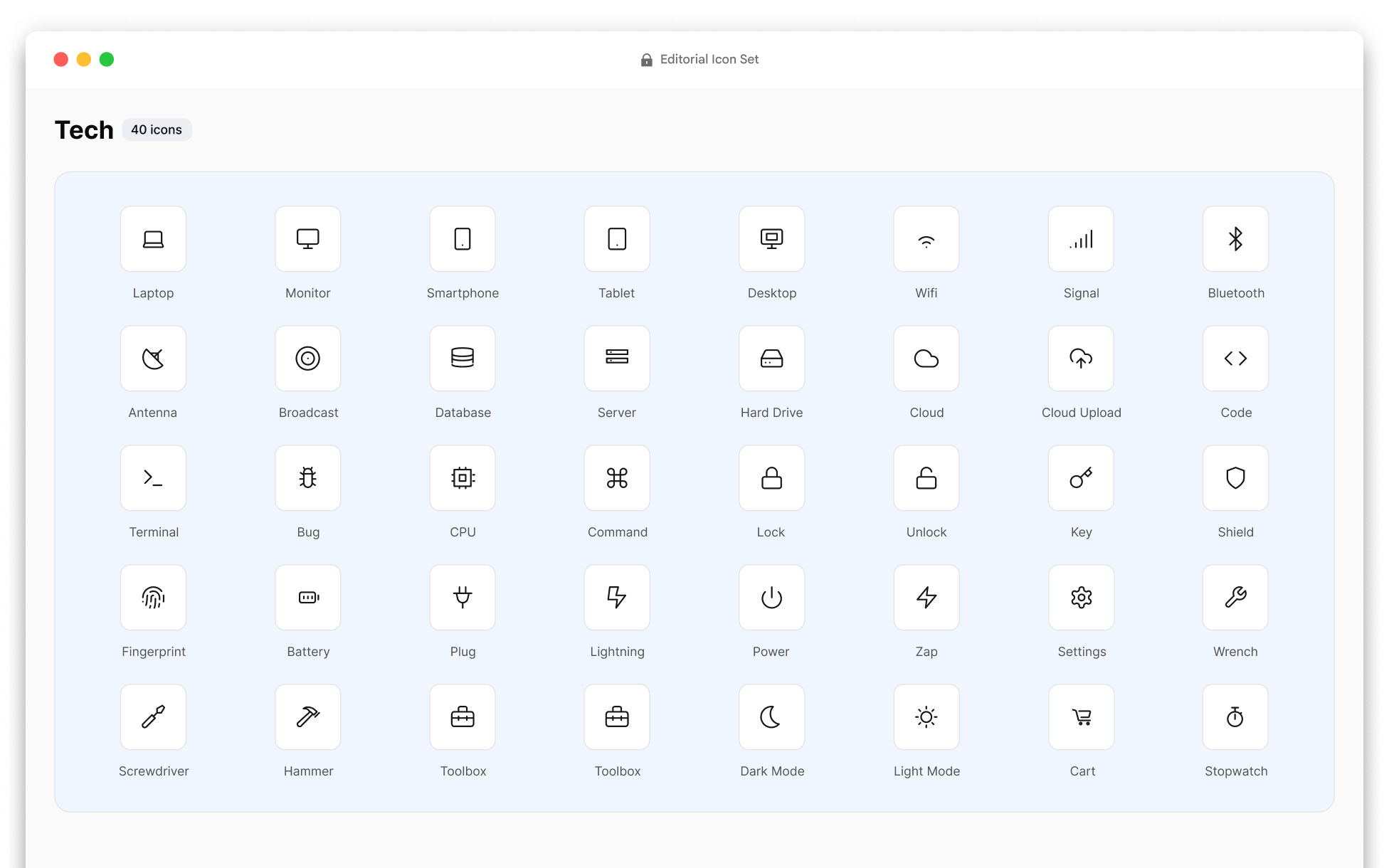
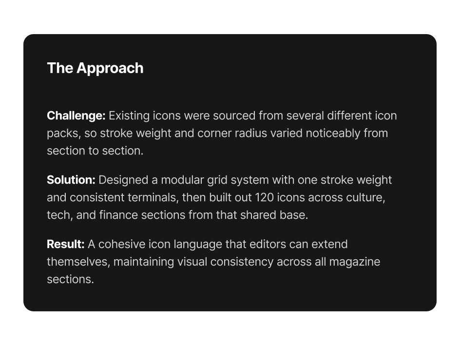
The existing icons came from multiple icon sets, resulting in visible inconsistencies in stroke weight, corner radius, and overall visual style.
The approach
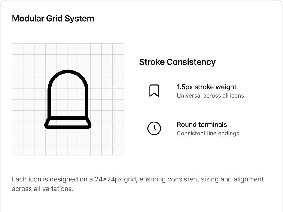
I designed a modular icon grid with a single stroke weight and consistent corner treatments, then created a library of 120 icons for the culture, technology, and finance sections based on this shared visual system.
The outcome
The result was a consistent iconography system that the editorial team could extend independently as new sections were introduced, without relying on designers to manually recreate the existing style.
Full case-study detail is shared directly with employers, hiring managers, and potential clients — I approve most requests within a few hours.
Request access