

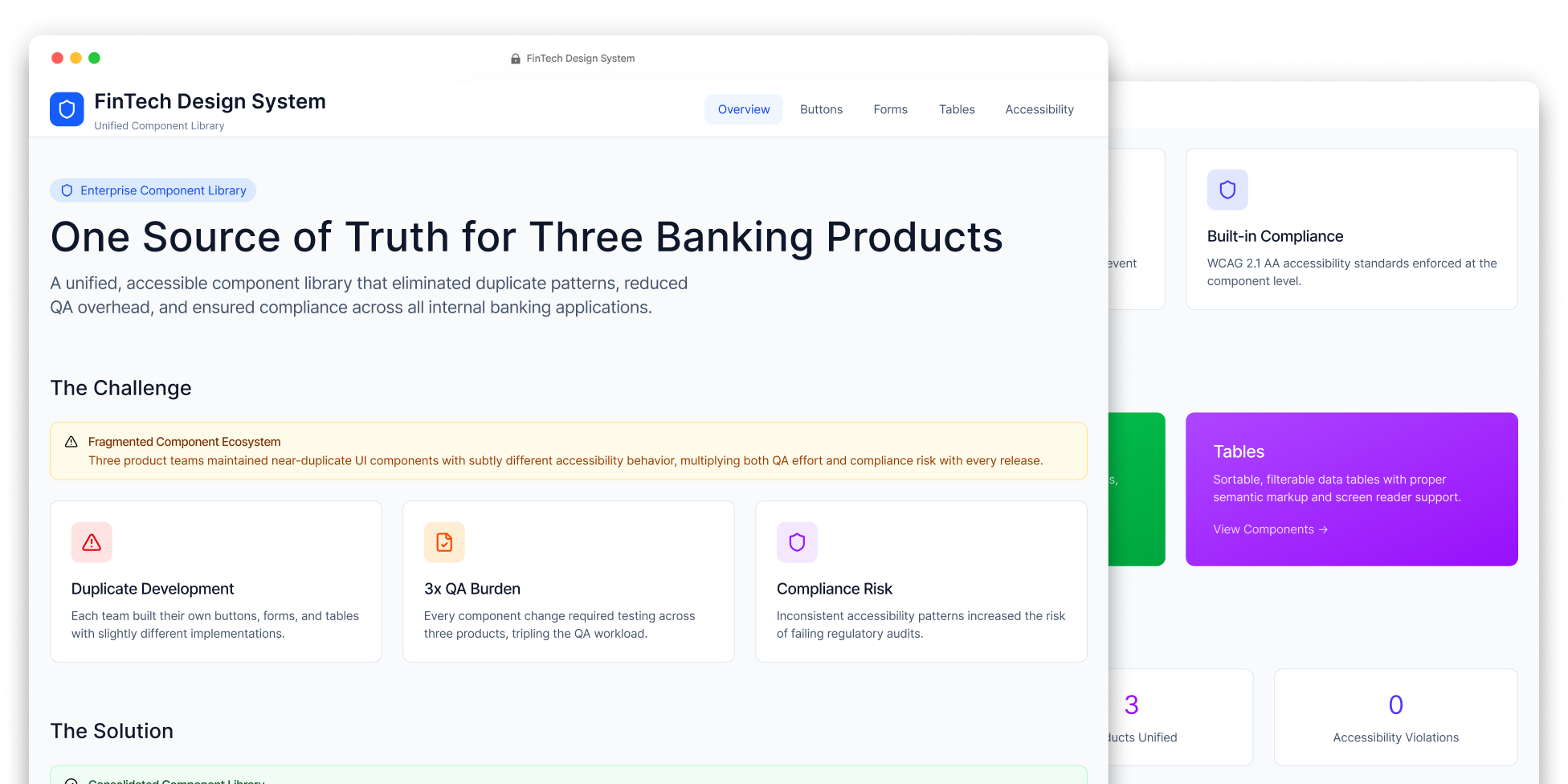
Component Library for FinTech
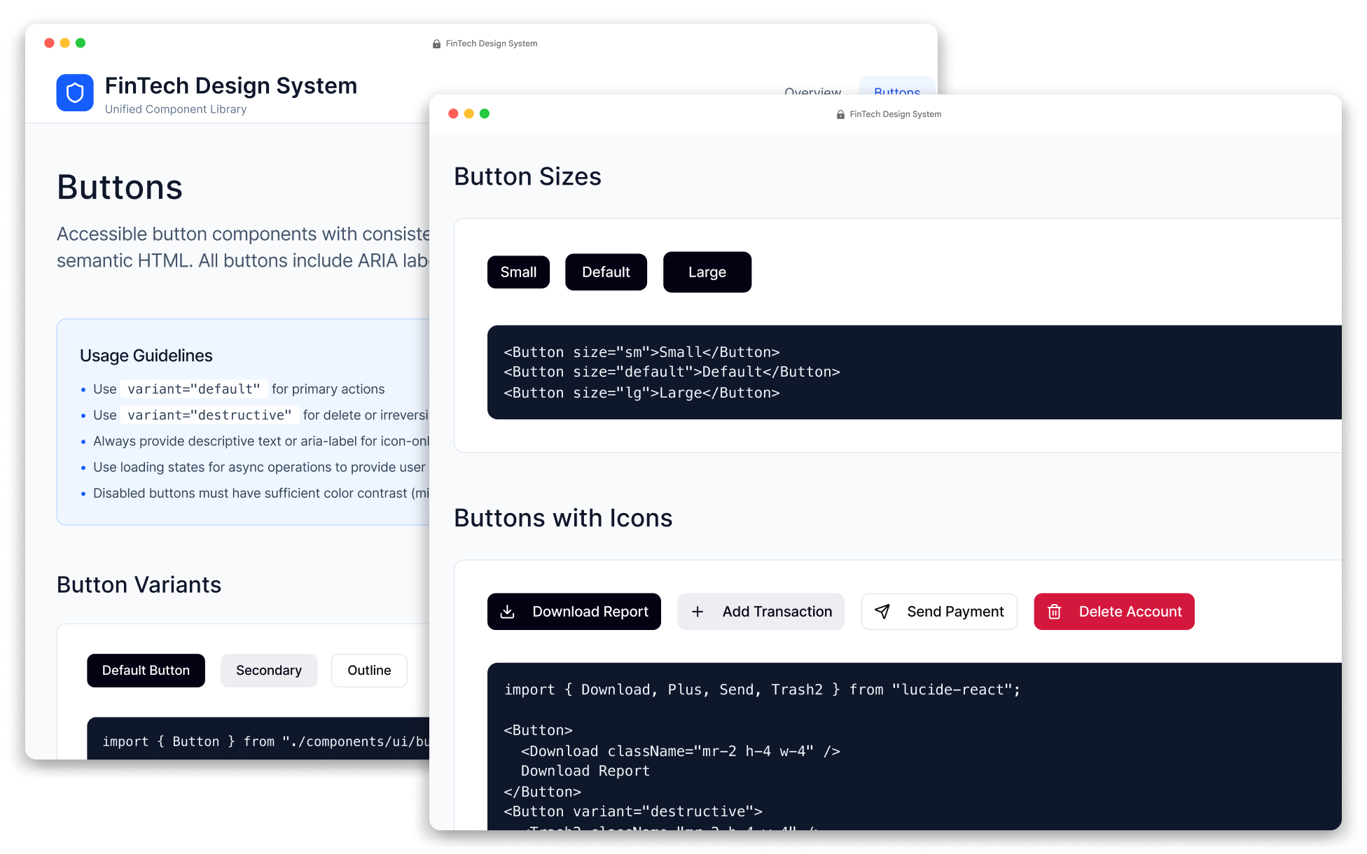
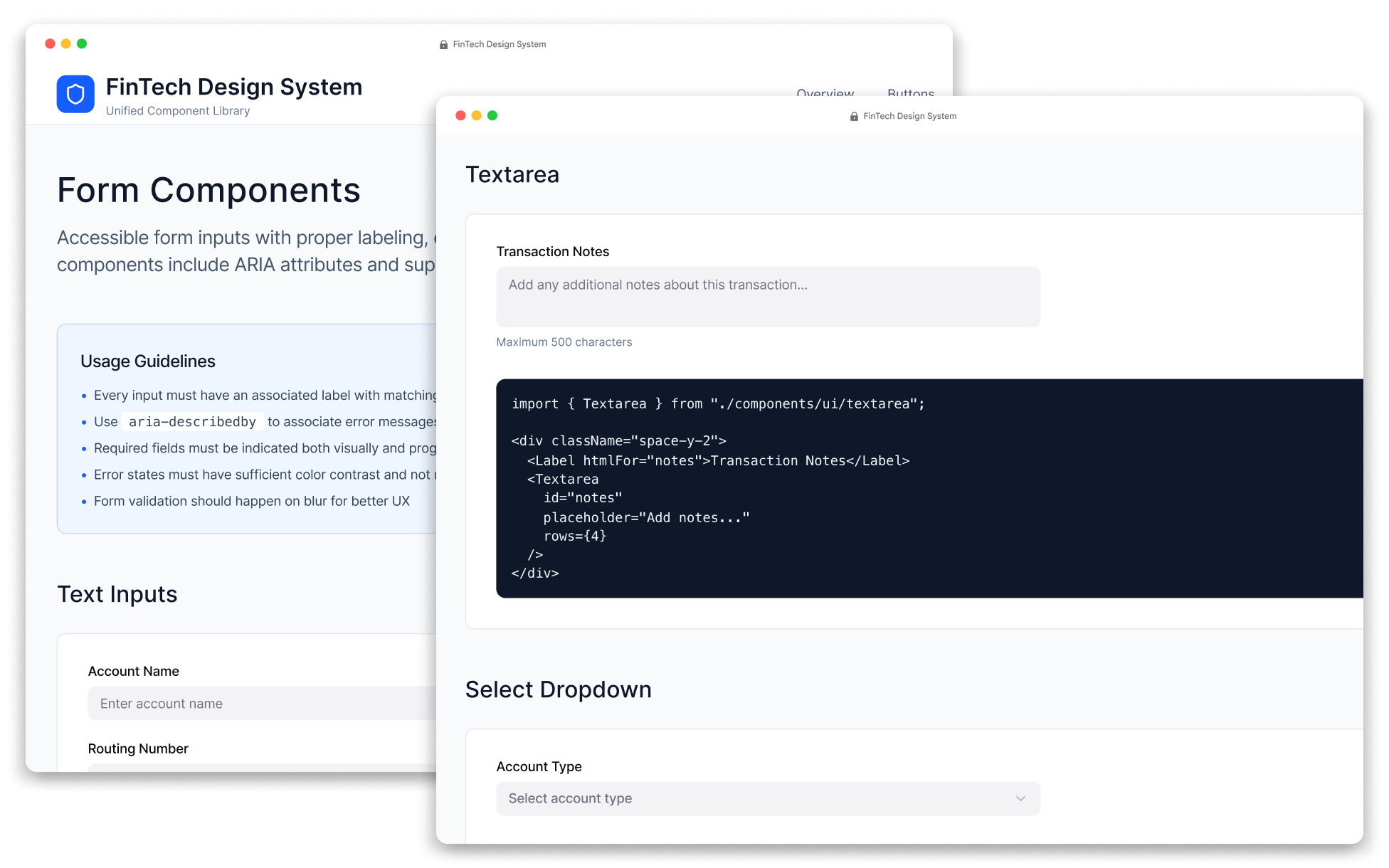
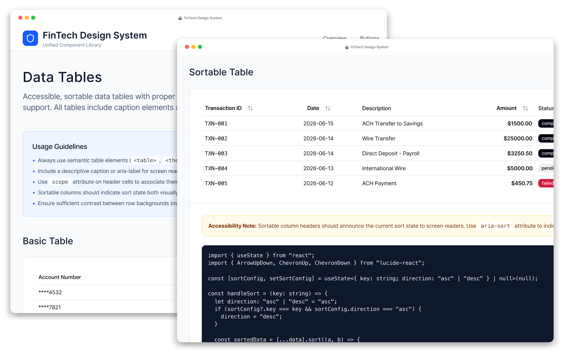
Three internal banking products had developed their own versions of the same UI components — including buttons, forms, and tables — each with subtle differences in behavior and accessibility. This project unified them into a single library of reusable, documented, and accessible components, providing all three teams with a common foundation for building consistent user experiences.
Role
UX/UI Designer
Year
2018
Platform
Design system
Team
1 designer · 1 engineer
The challenge
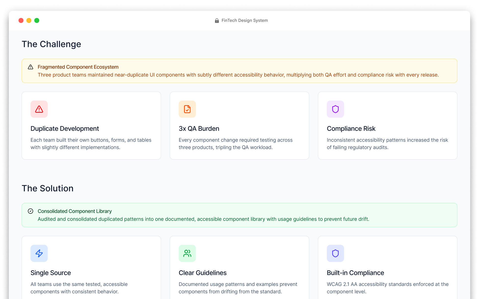
The three product teams were maintaining nearly identical UI components with different implementations, leading to inconsistencies, duplicated QA and accessibility efforts, and increased release risk.
The approach
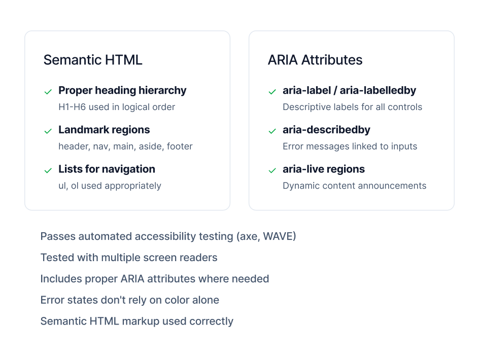
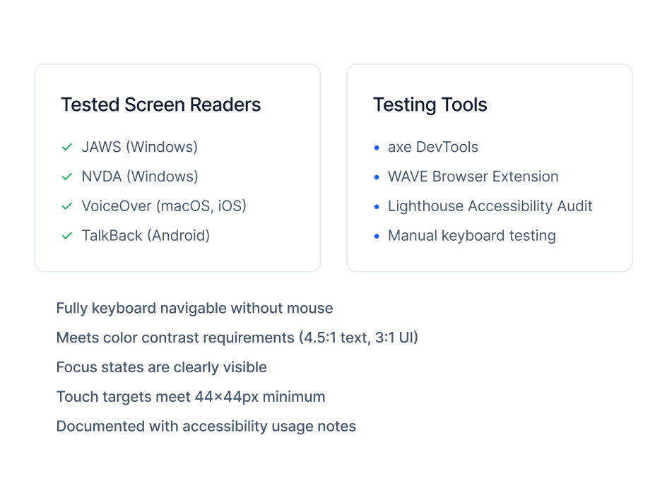
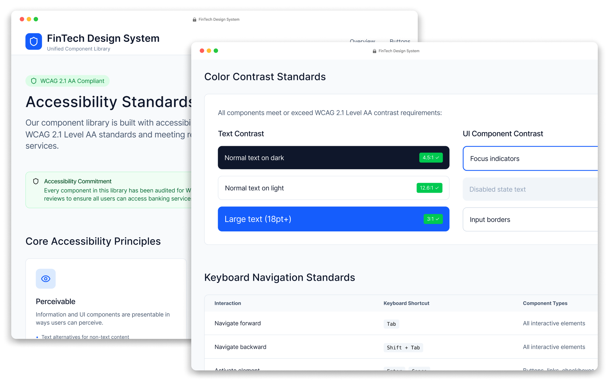
I audited the existing components, consolidated duplicate patterns into a shared component library, and created clear documentation and usage guidelines. Each component was designed for reuse, consistency, and accessibility compliance, ensuring that future development started from the same standards.
The outcome
The shared component library reduced duplicated effort across teams, accelerated feature development, and delivered a consistent experience across all three products. Accessibility compliance became a built-in property of the library rather than something each team had to validate independently for every release.
Full case-study detail is shared directly with employers, hiring managers, and potential clients — I approve most requests within a few hours.
Request access